Quick Posey survey! Help us out?
Posey Picks and the Bus Stop » Devlog
🐰📣 opinions needed!!
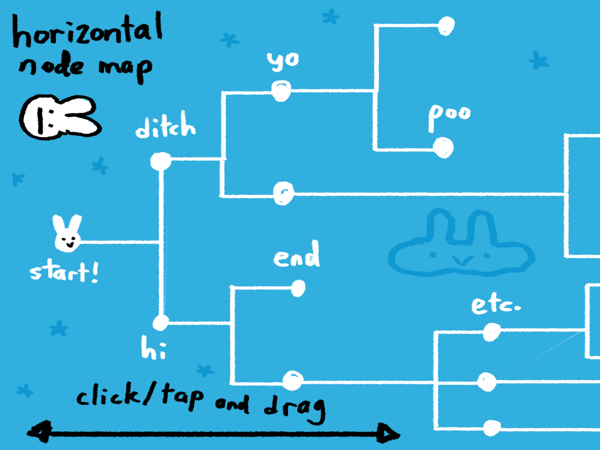
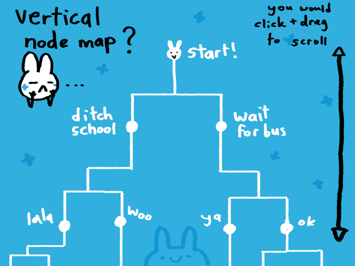
one feature we want to implement in future posey games is a node map where you could jump around to spots of the game you've already seen, to help you skip repetition and explore the game and its endings easier.
BUT... should this map be vertically oriented, or horizontally oriented? see rough examples attached 💡


Posey Picks and the Bus Stop
Posey's stuck at the bus stop! Help her choose what to do in this sweet & silly branching story game!
| Status | Released |
| Author | indooranimal |
| Genre | Visual Novel, Interactive Fiction |
| Tags | 2D, Casual, Comedy, Cute, Hand-drawn, Point & Click, Short, Singleplayer, Touch-Friendly |
More posts
- Posey Picks Soundtracks now on Spotify!Jan 26, 2021
- See you next year!Oct 09, 2020
- Posey Postcard Giveaway!Oct 06, 2020

Comments
Log in with itch.io to leave a comment.
horizontalllllll
I think the horizontal one would make sense. It kinda reminds me of a timeline. Also I like the squashed Posey PLEASE keep it
hehe thanks for the feedback!
i like the horizontal one! :●3
it really sucks that you can get so many fans from cute little simple drawings and I can't with my detailed ones! i love your work, think you can teach me how to get better?
I understand the frustration! But there are audiences for all kinds of art, and I'm sure you'll find some people who appreciate the amount of work you put into what you do. I keep things simple here both out of necessity (file size budget, time/energy) and because I'm not an especially skilled artist in any technical sense. So I'm not the right person to ask for how to be a "better" artist, but I wish you luck on your journey c:
I like the horizontal one, it's a bit more easy to read :)
cool, thanks for the input!
I prefer horizontal just because....
I'm too lazy to scroll down and because its easier reading the map horizontally !haha understandable! thanks for the feedback!
Hey,
First of all the Graphics of your Game look so Appealing and Cute!!....Great work on that, and Awesome Presentation
About the Node Map, since your Game is Oriented in a Landscape View, it'd be better to have the Node Map in a Horizontal Orientation as well as it scrolls towards the most accessible direction....If your game was in portrait mode the vertical would have worked better....But this depends on the preference and Visual Direction you'd like to go in the end....
Anyways, great work, and hope to see more awesome content for Posey Picks👍
thanks so much c:
makes sense to me! we do have some holdouts for a vertical orientation, which i understand, but if we can only pick one, we'll probably go with horizontal!
Maybe both if possible? As in, horizontal for pc and vertical for mobile. Otherwise, horizontal seems good.
that would be nice! but yeah, time/energy budget kind of leads us to just picking one, so it'll probably horizontal as you said!
vertical because of mobile desing
hmm, so far most of our mobile players have voted towards horizontal because of the landscape orientation. i can see where you're coming from though!
I prefer vertical (probably because I learned Twine some time ago) but it seems the majority of people like horizontal, so ya should probably go with that! (yes, I copied the comment below)
haha that's cool, i appreciate the input!!
I like vetical, just cause I like it, but seems like most people like horizontal, so you should probs go with that lol!
haha! thanks for sharing your opinion all the same! but yes, from here and all my social media channels, it seems horizontal has the advantage - but you weren't alone in preferring vertical!
I think I like the horizontal better for usability. The vertical is cool too for some reason it reminds me of a tournament.
i understand what you mean! and i think we agree with you on usability, especially for anyone who plays on mobile.
horizontal! its kinda easier to read like that
cool! thank you for replying!
I like the horizontal one better since it feels like you are moving forward imo.
cool, thanks for the feedback!!